• UI • UX • Mobile • Tool Interaction Re-design •
Project Overview
GAME TYPE: IDLE GARDGENING SIMULATION
PLATFOM: IOS (iPad - iPhone)
STATUS: WORK IN PROGRESS
About the game
Plant Therapy: NYC Edition features a cozy mobile game in which players can decorate their New York City apartment with plants, art, and more. By watering, fertilizing, and growing plants from sprouts, players can earn coins and unlock achievements.
Challenge
When transitioning Plant Therapy (PC version) to Plant Therapy: NYC Edition (Mobile version), the tool interaction was a challenge.
On the PC version, players could easily select tools from a tool stand with a mouse click. However, the mobile version's smaller screen and touch controls resulted in excessive scrolling, making tool selection tedious and disrupting gameplay flow.
The challenge was to redesign how the tools are presented, eliminating the need for constant scrolling and ensuring a seamless experience on mobile devices
The Solution
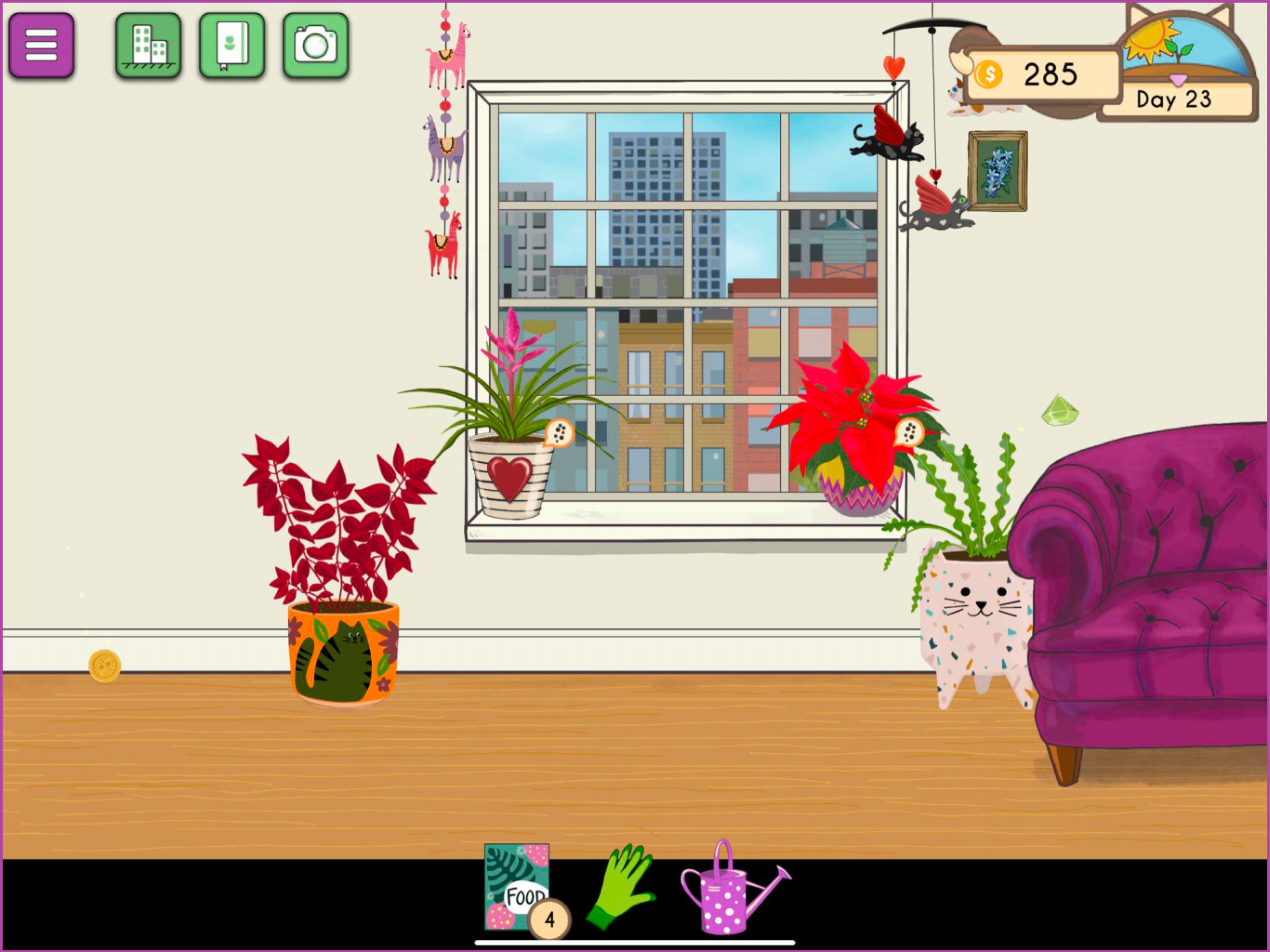
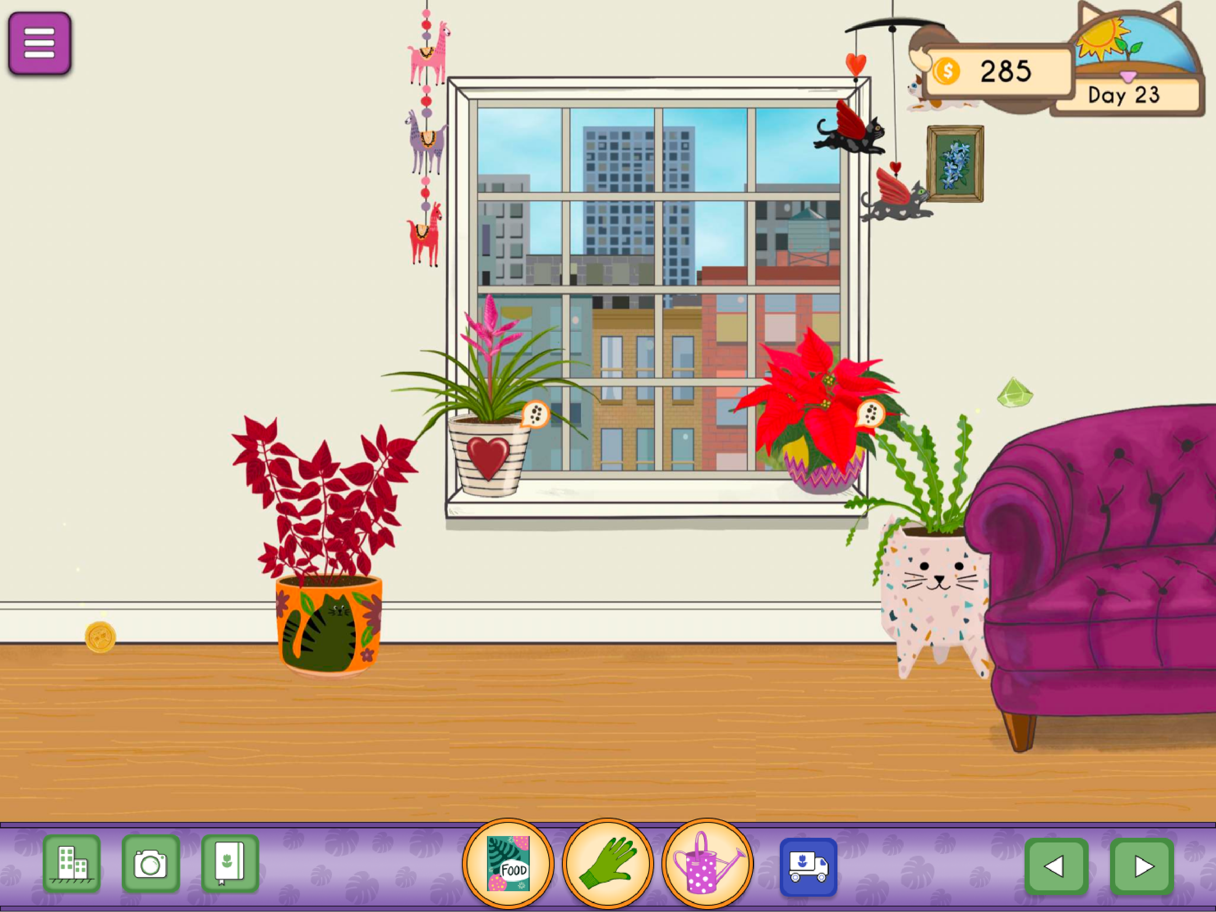
To reduce the constant scrolling, and because the transition from PC to mobile left unused space under the game (the artist wanted to maintain the game’s aspect ratio), we opted to implement a fixed toolbar in that space. This toolbar provided players with quick, one-touch access to the essential tools for taking care of the plants. Additionally, to balance the screen layout, the icons, game clock, and notifications were relocated to this area, maintaining consistency with the menus available in the PC version.
Internal team testing and player feedback confirmed the success of this solution, with many players praising the design and even suggesting that the toolbar be added to the PC version.
Project Roadmap
Tool Interaction on PC
To understand the problem, it is important to grasp how the original game designed for computers worked.
In the computer version, the interactive tools were presented to players as a shelf with tools in the interior of the apartment. The player could interact with any tool by clicking on it, and they could release the tool by pressing Esc or clicking the empty spot on the shelf. Additionally, keyboard shortcuts were implemented to reduce scrolling fatigue in large apartments.
Transitioning to Mobile
When the programmer started to transition the game to mobile, we noticed the following issues:
If we kept the game ratio on mobile, the screen would have empty spaces that appeared as black.
The segment of the apartment shown on mobile is smaller than the one shown on the computer, which generates a greater need to scroll and a more cluttered appeareance.
The shortcuts implemented on PC won’t work on mobile since the user doesn’t have direct access to the keyboard.
Affinity Map
Using affinity mapping, several themes emerged when I organized teh data of the current issues on mobile, the PC needs from players and what the team wanted.
Tool Interaction
Usability & Navigation
Display & Layout
Interaction Design Limitations
Low-Fidelity Designs
Different concepts were presented to the team in low-fidelity designs, each reducing visual clutter, and simplifying navigation. These concepts were based on the idea of filling the empty space at the bottom of the screen by creating a decorative element that could also function as a toolbar. This direction was agreed upon during discussions with the team regarding the existing issues.
Issue 1
This solution reduces visual clutter while providing a decorative toolbar at the bottom that fills the unused space. It maintains symmetry but generates a square filling, as all the subgroups are clearly divided. However, when discussed with the team, they wanted to remove all icons and suggested that we include directional icons to navigate through the apartment more quickly (scrolling through the apartment was not working properly at this point, and we used directional icons in the PC version in the past).
Old
New
Issue 2
This solution reduced the subgroups and added the required directional icons. The team liked the balance and symmetry but was unsure about moving the game clock to the bottom since the decorative clock, which can be purchased through one of the DLCs, wouldn’t work in this version. At this point, the programmer had refined the scrolling, and we concluded that we should add information about scrolling during the game’s onboarding process and remove the directional icons.
Additionally, to increase accessibility, we decided that if we moved the clock back to its original position, we could center the tools so that both right- and left-handed users would have equal access to them.
Old
New
High-Fidelity Designs
At this stage of the design process, the visual appearance of the toolbar began to influence the design. For this high-fidelity iteration, different color schemes were introduced, along with the following changes:
The tools were centered on the screen so that both right- and left-handed players could access them with equal ease.
The icon distribution was kept similar, and the clock was moved up, as it had been considered a decorative element from the beginning.
The newly created empty space in the bar was used to display notifications for achievements or shipping, which appear occasionally in the game.
Color Option 1
For this option, more neutral colors like brown and cream were used to blend the toolbar into the cozy space, while complementing the green that will eventually fill the apartment.
Color Option 2
For this option, a complementary purple was used as a base so that the icons would pop and create a more cheerful appearance.
Outcome
With the high-fidelity design, the team concluded that the interaction would work and that it would be implemented in the game for further testing. Additionally, the burger icon will be moved to the bottom of the screen since it would be inconvenient to navigate over the game area to access it.
Here is a screenshot of how the interface looks when implemented in the game:
My main goal for this case study was to present the redesign thought process I went through when redesigning a feature that accomplishes the same objective but is presented in a different way to create a better experience in the medium it is displayed.
During this process, I understood the importance of understanding the medium you are designing for, as well as the advantages, disadvantages, limitations, and common patterns that these platforms offer. Before this project, the projects I worked on were mainly for computers, so I’m grateful for the experience of tackling a redesign between platforms.
For me, it was important to notice that mobile elements heavily rely on touchscreen actions for interaction, such as swipe, and scroll, among others. This can generate fatigue or become tedious, whereas performing similar actions on a computer may feel less tiring due to mouse movement. Additionally, mobile users are different from computer users, and their expectations and needs, even though they might be similar, are distinct. The common knowledge a mobile user has about games varies since mobile users include a wider range of individuals than computer users. More casual gamers and less tech-savvy users are often found on mobile platforms, which is why additional instructions were implemented in the game for onboarding.
Thank you for reading!
Explore my other case studies:
Plant Therapy
•UI • PC • Game Design •
•UI • UX• Mobile • Design Practice •


