• UI • UX • PC • Testing • Game Design •
Project Overview
GAME JAM: ADVENTURE GAMEJAM 2022
DURATION: 2 weeks
GAME TYPE: PUZZLE - ADVENTURE
LEVELS: 1
STATUS: FINISHED
TEAM:
Randy Larson - Programmer
Georgeth Lyver - UX/UI Designer
Trevor Redfern - Audio Designer
Cindy Rivera - UX/UI Designer (Me!)
Jennevieve Schlemmer - Artist
ABOUT THE GAME
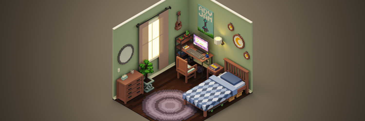
Kittyverse features a one level point and click adventure game that takes the player and their cat to a foreign, colorful universe, where the player has to solve puzzle to get their cat back, and go home.
ABOUT MY EXPERIENCE
I joined the project as the second UX/UI designer of the team. The game was designed for the Adventure Game jam 2022, and this was my first time working on a team as a UX/UI designer and developing a game
Game jams are typically fast-paced, and we were given two weeks to create an entire game. The design process was adjusted to meet our needs and accomplish our goal within the time frame.
Project Roadmap
Ideate
Every game jam has a rushed start. The first day we gathered together (through Discord) to clarify a few things:
What kind of game did we want to create?
What story did we want to tell?
What goals did we want the players to have?
How would they achieved these goals?
The final decision was that we will make a side-scroller point and click game. Even though we had a variety of colorful ideas, due to the nature of game jams we had to be conscious of the narrow scope we had. We constantly check in with each other to determine and limit our ideas since we did not want overwhelm our team or deliver an unfinished product.
User Journey as a Text - Based Storyboard
One of the first steps in our creative process was to determine the user journey. In the case of a video game, a text-based storyboard is fairly similar to a user journey.
Non-Playable intro
Mc is watching a black and white TV with their cat.
Suddenly the TV has colors, and it sucks the Cat.
MC goes after the cat.
Playable game
Mc is trapped in another universe.
Cat is out of their reach.
MC must solved puzzles, so they can get their cat back.
Non-Playable ending
Mc has their cat at reach, so he pick it up.
MC and cat return to their own world.
MC is back at their world in front of the TV.
We expanded on this general idea later by determining the quantity of puzzles the player should solve, and what each puzzle entails.
Puzzle 1
Cat is stuck on the fridge.
MC needs cat’s attention.
MC plays their favorite music.
Puzzle 2
MC needs to help the cat get down from the fridge.
MC must create magic stew.
Puzzle 3
Cat didn’t finish coming down.
MC needs cat’s attention
MC bakes cat threats.
User Stories
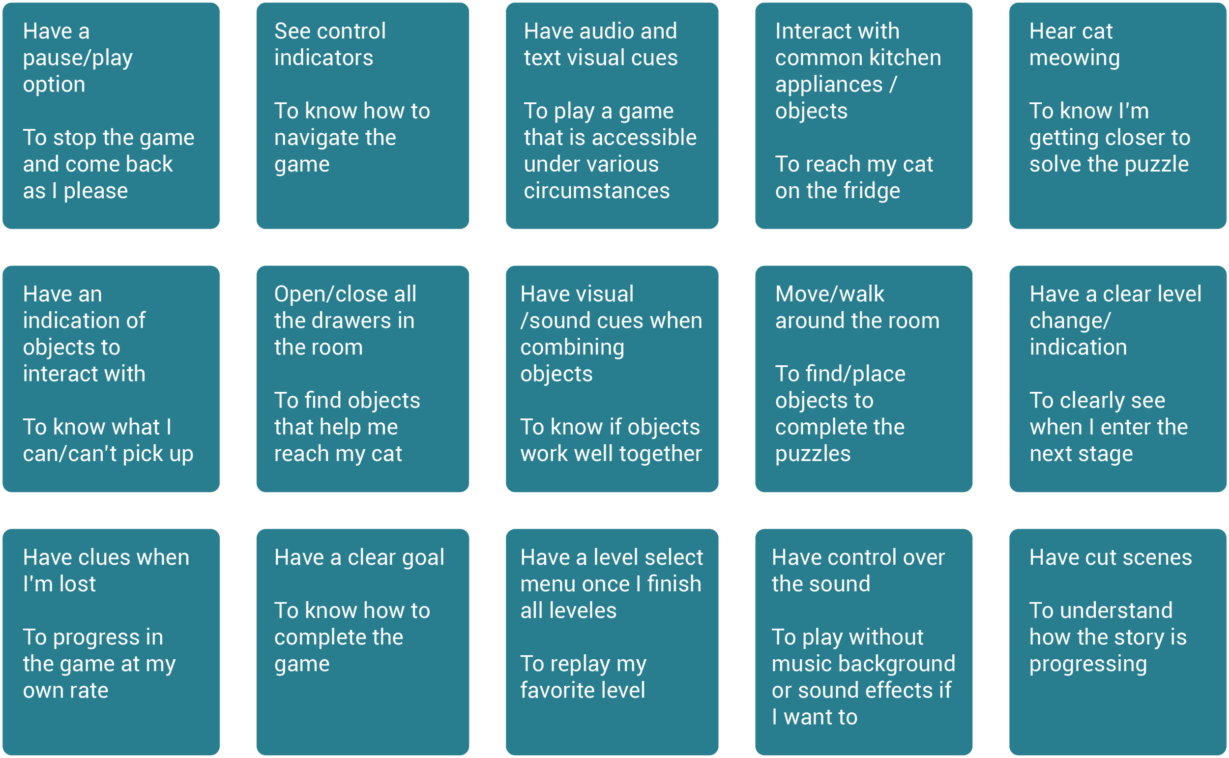
Georgeth (the other UX/UI designer) proposed that we made some user stories. User stories are statements written from the perspective of the player (the user) . These stories let us understand the players needs, and help us to explain why we should include certain features in the game. We came up with a total of 15 user stories.
As a player, I want to… So that I can…
These user stories gave us a list of potential features, but the final decision about which ones would be include depend on the team decision. We shared this information with the team (programmer, artist and sound designer) so we could decide:
If it was possible to implement these features in the remaining timeframe (we had 12 days left at this point).
The level of importance of each feature.
After the discussion, we broke the features up into three categories: features that were a priority, features that will be implemented if there is time , and features that we would most likely not have time for . We then color-coordinated them to reflect our decisions:
Features that must be implemented
Features to implement if there is time
Features that will not be implemented
As a team, we agree with most of the elements from the user stories. We also knew it was important to provide feedback through more than one element (visual or audio) so the player could easily understand how their character was interacting with the world, their progress and as encouragement to finish the game.
Just one user story did not make the cut since it would have involved a bigger scope, which requires more time than the one we actually had. However, we agreed to implement other different features if we had time, which would be a great addition to the game. But based on time constraints, we will have to reevaluate the scope when the time comes for implementation.
Mood board
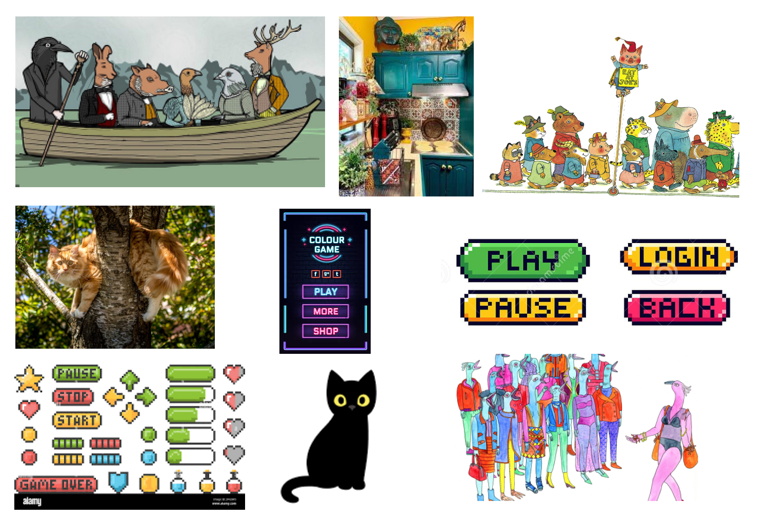
Once priorities were defined regarding what was needed for the game, we discussed visualizing how the potential game might look. As a team, we created a mood board to help us define aspects such as art style, UI style, and aesthetics, among others, that we felt would look good in the game.
Color, typography and logo
Color palette
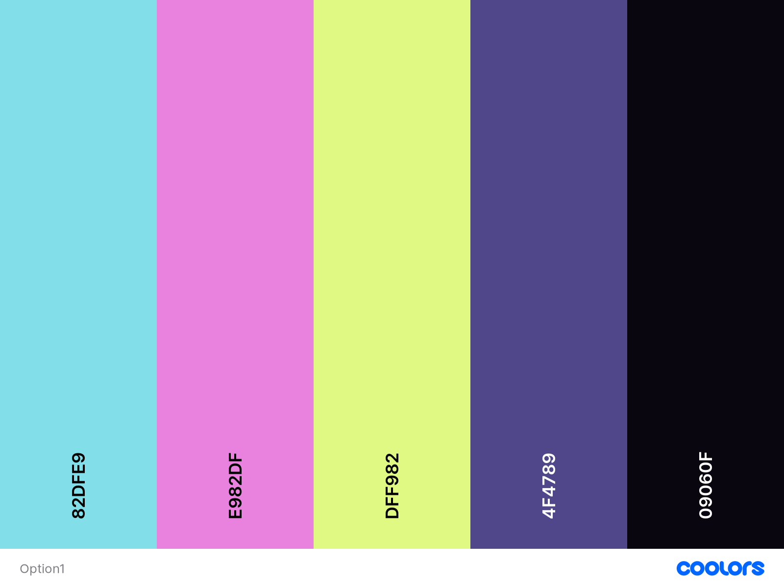
My focus for the first part of the game jam was to work alongside Geo (the other UX/UI designer) to develop the game identity. On my side, I figured out a color palette that would match and pop up in the art idea the artist provided. Geo helped me improved tis palette by adding the darker color closer to black which we will use for the text elements in the game.
Designed color palette
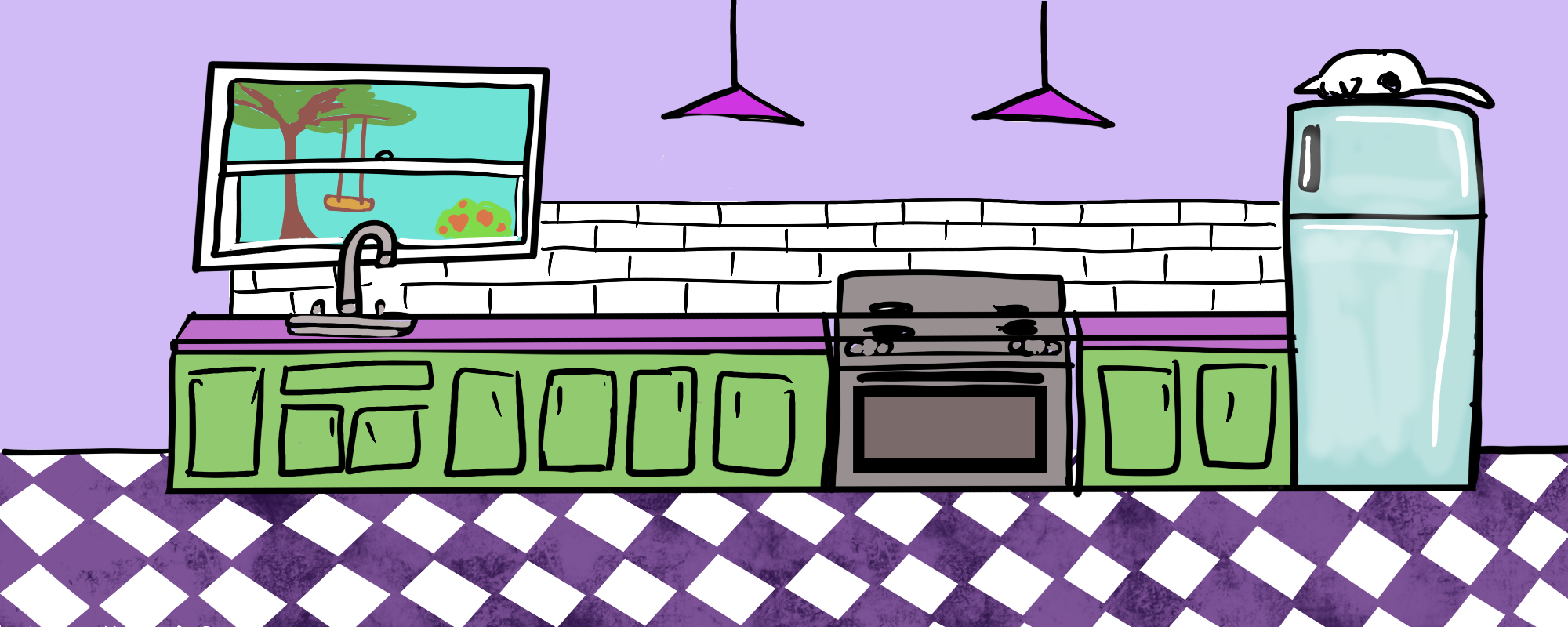
Draft art provided by artist
Typography
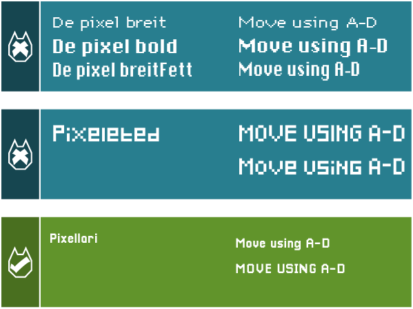
Additional to the game palette, my focus was also on finding a free-to-use typography that could adapt to our design idea. I was searching for a readable, pixel art font. During my research, I came across several fonts that could suit the task, so I presented the best options to the team. We chose the one with better readability that all the team members liked.
The chosen font was Pixellari. However, it would be preferable to have a font with different weights like De pixel breit. However, because the game will not employ too much text and it will be a short game that uses mostly graphic assets for cues, the font Pixellari will work well.
Logo
At the same time, the other designer came up with a logo that show the contrast between the universe that Meeple and Kitty live in in comparison to the universe they are transported to where the game is taking place.
Logo designed by Georgeth Lyver
Non-diegetic UI
Georgeth, the other UX/UI Designer, took the lead about the non-diegetic UI , and I helped with it. Non-diegetic UI exists for the player’s knowledge, but is not acknowledged by in-game characters or the game’s world. Some examples of it are: health bars, score displays, etc...
As a team, we drafted and finalize the UI elements to be included in the game. Here are a few of my concepts, and our final iterations:
Buttons
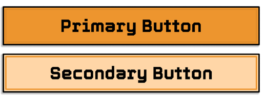
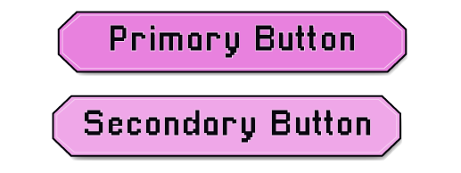
Georgeth designed the inial standard buttons. These buttons utilized drop shadows/inner shadows to add a sense of depth, and with the intention of creating a hover state in the actual game. In order to play into that cartoony, 2D look, Geo added a black border around the entire button and included an outline within the button that was slightly darker than the overall color of the button.
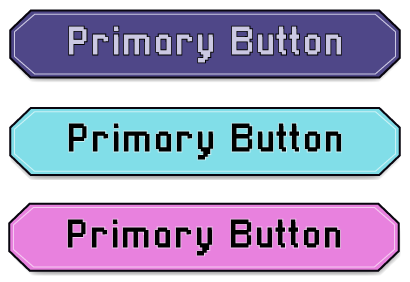
We presented the initial button design to the team and gathered some feedback. We concluded that the buttons should have a more pixelated style, similar to the font. Based on this feedback, I iterated and modified the button Geo had created. To achieve a more pixelated style and to follow the color palette we had designed, I adjusted the shape of the button to have angular edges and defined the color we will use for action buttons. Instead of using shadows for the hover state, I utilized darker colors to emphasize the state change. These are the buttons that are in the game.
Initial design by Georgeth Lyver
Color iteration by me
Final design by me
Icons
Georgeth design the style of the initla icons and did most of them. She began with rounded icons before transitioning to octagonal icons with slightly smaller text. Same as with the buttons, this change was made so we could follow the “pixelated” style of the font and logo. For the icons, I designed the sound icon, which had variations for sound on and off. For this icon, I proposed to have a musical note with cat attributes.
Designed by Gerogeth Lyver
Designed by Cindy Rivera (me)
Inital concept icons
Designed by Gerogeth Lyver
Designed by Cindy Rivera (me)
In-game implemented icons
Static UI
I took the lead about designing the statitc UI required for the game. Static UI consists of screens and elements that stay the same throughout the game, it offers information or options to the player without affecting in-game characters or the game world. Examples of static UI include splash screens, credits screens, and instruction screens, which help inform or guide players before or after gameplay.
Splash Screen
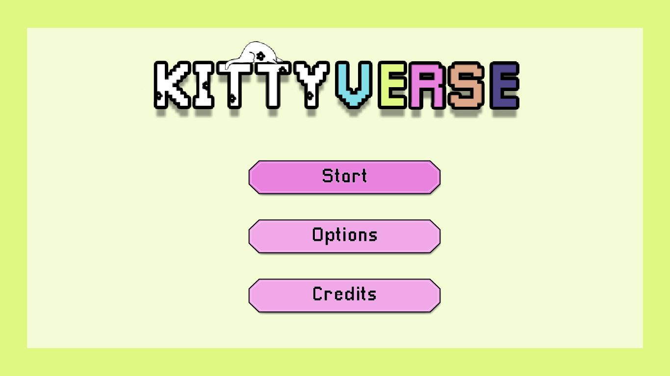
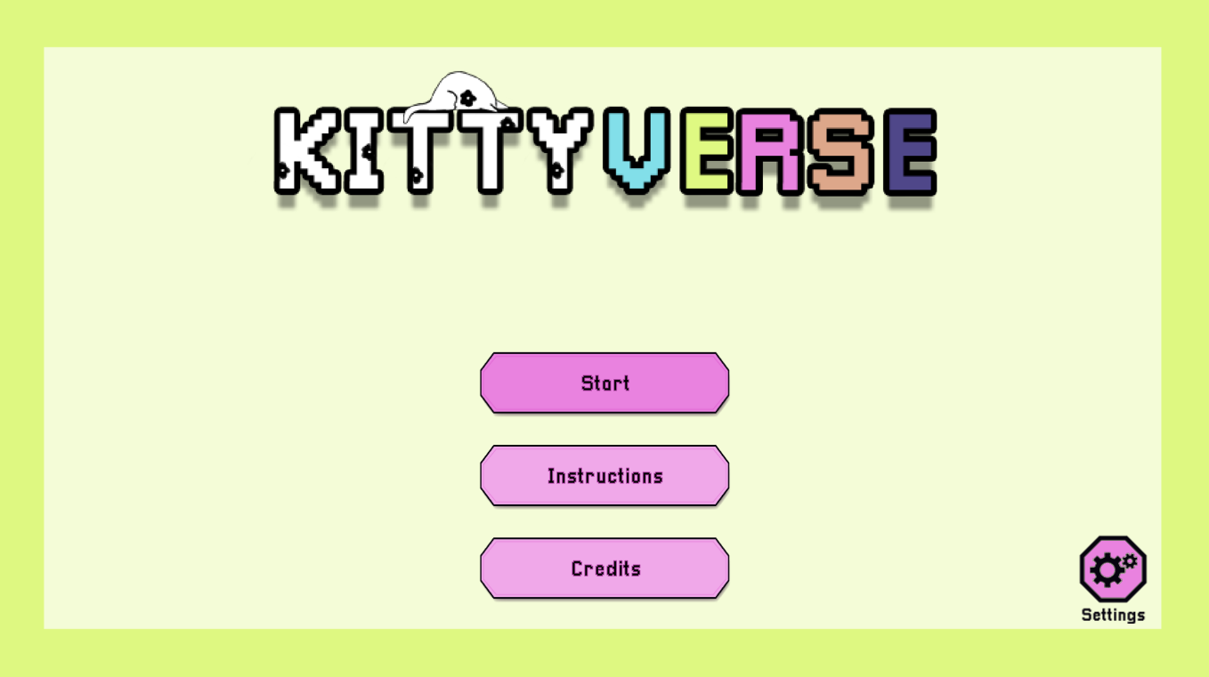
For the design of the splash screen, I created a basic background consisting of a single-color backdrop framed by a darker version of it. I included the game logo at the top and the limited game options we wanted to offer the player, reflecting the simplicity of the game. The initial design did not include instructions on how to play, but after discussing it with the team, we concluded it was necessary to include them to help new players familiarize with the game mechanics.
Inital splash screen design
Final splash screen implemented in game
Instructions Screen
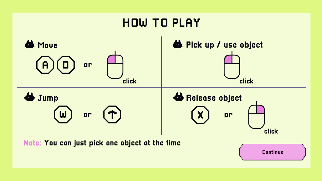
The instructions screen followed the same background design used in the splash screen. We opted for a visual representation of most of the instructions in order to reduce the need for reading by the player. I split the instructions into the four main in-game actions, and represented the keyboard keys with a hexagon, following the style we had developed. Additionally, the mouse had angular corners.
The importance of the instructions screen was to show the players the game controls, and to clarify that the MC (meeple) can only hold one object at a time. This way, new players would be able to understand how to interact with the game without getting frustrated.
Final instructions screen implemented in game
Playtesting
As the creators of the game, we recognized that we were too close to the project. We had spent many hours playing the game and had seen all its iterations. Because of this familiarity, it was easy for us to overlook details that new players might notice right away.
Therefore, in order to develop a game we would be proud of, we decided towards the end of the jam to conduct some playtesting to to identify any bugs we might have missed and to determine:
If the game was enjoyable and fun.
If the players could finish the game.
If the team was able to convey the story.
With Georgeth’s help (the other UX/UI designer), we shared questions we wanted to ask the players, and each one conducted their own usability study. In my case, I watched 5 people play the game from beginning to end and interviewed them afterward. I offered support during the gameplay in case they got stuck in the game. In total, we tested our game with 10 different players and gathered their feedback to improve the game.
Some of the questions we asked were:
Where in the puzzle was there miscommunication? What did you expect to see instead?
What do you expect to see next after completing this puzzle?
What would you have liked to see in the game?
(If applicable) How can the puzzles be made clearer?
Findings
Our playtesters helped us uncover a few bugs, and our programmer was able to jump on the task immediately to work out any issues. Additionally, we were able to determine the following things about our game:
Was the game enjoyable and fun?
Players said that the game was enjoyable, and people loved the world interactions we added. Even those who got stuck still liked the game.
Could the players finish the game?
Some players were unsure of their objectives in the game. They asked for extra clues, and assistance to complete the game.
Was the team able to convey the story?
Even though the players enjoy the world. They were unsure about what was happening. Every player understood a different story.
Solutions - New Additions
After the playtest, a different set of bugs was found, so the programmer focused on addressing those before improving the gameplay. We discovered that the current thought bubbles needed to provide clearer hints to the player in order to be useful. Furthermore, we decided that we would add a few elements to clarify the tasks and goals for the player. These additional elements were intended to enhance the clarity of the thought bubbles.
Some of the new additions that we added before submitting our game include:
Checkboxes
Because the players were not clear about their game progress and goal. We (the UX designers) proposed to add an indicator (checkboxes) that will represent the quantity of puzzles in the game, and the progress of the player. The team was thrilled about this idea, and Geo designed a cat-shaped checkboxed that will get a green checkmark every time a puzzle was completed. Furthermore, an auditory cue was added to reinforce the player feedback about the complete puzzle.
Cat shaped checkboxed designed by Georgeth Lyver.
Cookbooks
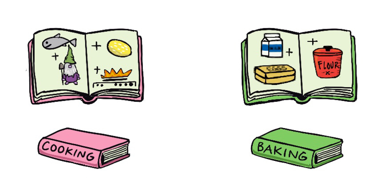
As a team, we decided that the best approach to assist players who were getting stuck was to convey the information about the ingredients needed for the puzzles related to mixing elements. The other UX designer suggested presenting this information as a cookbook to blend with the kitchen environment. Additionally, I requested that the programmer include a visual of the cookbook after a certain period, allowing players to search for it. However, if they took too long, a thought bubble would indicate the closed book, prompting them to find it. Here are the cookbooks used in the game, provided by the artist.
Cooking books drawn by Jennevieve Schlemmer
My experience helping to develop Kittyverse was amazing. I was able to experience firsthand how UX/UI affects a game. In addition, I had the opportunity to learn from Geo, who is a more experienced designer. She helped me understand my role better, as well as how a designer should present their ideas.
The team who worked on the game were wonderful people with great talents, and the platform to upload the game (itch.io) was an amazing place to get feedback through comments. We were lucky that we also had one person streaming the game on Twitch!!, so we could see clearly how they played. I learned that game jams are an excellent place to connect, and practice your skills.
Thank you for reading!
Explore my other case studies:
Plant Therapy
•UI • PC • Game Design •
•UI • UX• Mobile • Design Practice •

